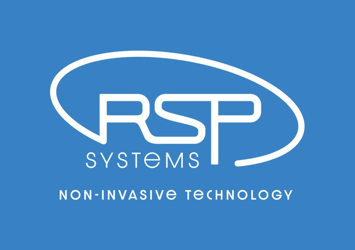
We are excited to release the new visual identity of RSP Systems!
We have taken our existing logo and updated it to better reflect our belief that technology can empower people’s lives by not being intrusive.
The essence of our new logo:
The shape is an oval to represent how RSP’s humanity and technology surround patients to improve their care.
The blue colour represents our ambitions to create technology that empowers its users because of its’ stability and reliability.
Our tagline reflects our confidence in the world of possibilities we have to create new products based on our technology. The font is distinctive, reflecting the fact that we are working with a technology that has never been seen before.
Stay tuned in the coming months for the launch of our updated website.
Our new visual identity has been developed in cooperation with Six Degrees Medical, a medical communication company based in Toronto, Calgary, Montreal, the United Kingdom, and Switzerland.